Keeping up with design-speak can be challenging, especially for non-designers. Trendy terms come and go, but there’s a solid base of essential terms that will improve your communications. Consider this as a cheat sheet.
Color is an essential topic
Color can help us define a brand identity, provide an emotional connection, and even have psychological effects on people. Color theory has a huge role here. Choosing the right colors can be crucial to the start of a connection to your consumer.
Once you’ve determined your colors, now what?
The next step is making sure that your color connection lasts across different media. Understanding the differences among color modes can help. Following are three common color modes you might come across.

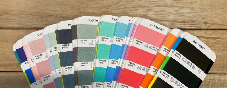
PMS—the universal language of color
Pantone was a commercial printing company founded in the 1950s. Lawrence Herbert, a Hofstra University graduate, used his knowledge of chemistry to organize the company's pigments and inks. Instead of using a four-color system (CMYK), Pantone uses 14 base pigments (including black) to produce their colors.
The name Pantone Matching System (PMS) was created to define the new system of color reproduction. Since establishing itself, Pantone has become the universal language of color. It is best to start with a Pantone color first and then break it down into CMYK and RGB color modes.
PMS color mode is best used for brand consistency and merchandise. Each printer is calibrated differently and may not print the same from different print vendors when using CMYK. Using PMS colors guarantees a match across materials regardless of the printer or print vendor is used.
However, PMS tends to be more expensive, so be mindful of what you are printing. If you don't need complete consistency, you probably don’t need PMS.

CMYK
CMYK colors are defined as cyan, magenta, yellow, and black. The color codes range from 0 to 100 and are a combination of numbers. In the MarketReach, Inc., logo, our CMYK combination is jade (C-90, M-99, Y-0, K-8) and grape (C-99, M-0, Y-70, K-0). Each color mode is unique and provides a slight variation.
CMYK color mode is best used for printed assets. This mode tends to be much more cost effective.
RGB
These are red, green, and blue. The color codes range from 0 to 255 and are a combination of numbers. Look at the MarketReach logo. Our RGB combination is jade (R-0, G-151, B-117) and grape (R-51, G-0, B-114).
RGB color mode is best used for web/digital assets. In my experience, print shops might ask you to convert your color mode from RGB to CMYK. If you don’t know how to achieve that, make sure to reach out. They are there to help educate and support you.
I hope you are better equipped to determine which color mode you need in different situations.